Because We Said So
What constitutes a collection is probably open to question, but the word generally implies a kind of conscious gathering, a search, a tenacity, a sense of discrimination, a discipline of choice. Decisions are made, items are added or subtracted. No such deliberation has ever been remotely involved in my collection of Pentagram Papers. All I ever had to do was walk to my mailbox.
Because that is the way they have come to me, this series of little black pamphlets, published more or less regularly by Pentagram Design, the widely respected international design consultancy founded in London in 1972. (Pentagram now has offices in New York, Austin, San Francisco, and Berlin.) First published in 1975, the little black books come with little by way of explanation—just this terse sentence printed on the inside back cover:
“Pentagram Papers will publish examples of curious, entertaining, stimulating, provocative, and occasionally controversial points of view that have come to the attention of, or in some cases, are actually originated by, Pentagram.”
Not surprisingly, these adjectives reflect the firm’s idiosyncratic approach to its work everywhere. Pentagram has mounted exhibits at the Rock and Roll Hall of Fame; created logo and signage for the Tate Museum; produced annual reports for Coca Cola; designed book jackets for novelist Paul Auster; and created an identity campaign for the town of Celebration, Florida. The recently opened Harley-Davidson Museum in Milwaukee was designed by Pentagram architect James Biber. Pentagram’s reach is as broad as it is deep.
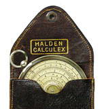
But back to the Pentagram Papers, which have little to do with the needs of Pentagram’s clients, and much more to do with the eclectic interests of the partners. Each pamphlet has a matte black cover and white rules. Measuring only 5 ¾ wide by 8 ¼ tall, it’s a modest little package that doesn’t hint at the riot of graphic material inside. Subject matter, layout, and format all vary. Pages might be bound by French fold or accordion fold. Format might be horizontal, covers, die-cut or embossed. Paper stock and typefaces diverge wildly. Subject matter, generally determined by collegial exchanges at the company’s annual meetings, has ranged from African pictographs, chapels made of corregated tin, and souvenir albums; to the vanishing slide rule, architectural toys, Chairman Mao buttons and lighting at the Savoy Hotel. One or two pamphlets are published each year, printed in runs of 4,000-6,000, then sent out to Pentagrams’ clients, colleagues, and friends. My own collection is just a product of dumb luck.
The Pentagram papers’ stated purpose is to explore visual ideas that might not call for an entire book, as well as to reflect something of the diverse interests ever percolating at Pentagram, reaffirming its identity as an unpredictable creative resource for architecture, exhibit design, signage, identity programs, interactive design, logos, book jackets, graphic and product design of all ilks.
But as the collection grows, it becomes clear that the papers serve purposes beyond those stated, having more to do with mapping the infinitely varied avenues by which visual information comes to us. As partner architect James Biber says, “These [pamphlets] began with John McConnell, one of the early partners; he helped developed the ideas; they weren’t rubber-stamped. McConnell was keen on ideas. Especially the idea that you could actually learn something.”


 Akiko Busch writes about design, culture, and the natural world. She is the author of Geography of Home: Writings on Where We Live and The Uncommon Life of Common Objects: Essays on Design and the Everyday. Her most recent book, Nine Ways to Cross a River, a collection of essays about swimming across American rivers, was published in 2007 by Bloomsbury/USA. She was a contributing editor at Metropolis magazine for 20 years, and her essays have appeared in numerous national magazines and exhibition catalogues. She has taught at the University of Hartford and Bennington College and has appeared on public radio in the U.S. and Canada. Currently she a regular contributor to the New York Times Sunday regional section and teaches at the School of Visual Arts in New York City. She lives in New York’s Hudson Valley with her husband and two sons.


