Classic and Classy Penguins
The cover for A Room With a View was a drawing done on that same Italian trip; that’s the Ponte Vecchio in Florence in the background. At first the little penguin appeared on its orange panel at the bottom of each cover which I feel makes it look a bit of a muddle—the orange meant an extra colour and the drawing already has a lot of different things to fit in amongst. This was something that I learned to live with later on, with stamps; but here it was already something that I didn’t particularly want, asserting itself at the bottom right of the book. When individual titles were reprinted a year or two later, the series grid had been cleaned up a bit, without the orange, which I think was a small but important change that made it simply look right. One could hardly imagine a simpler or a more logical way to make a drawing work alongside typesetting and strips of grey, and the beautiful black and white penguin was up there now on the top left.
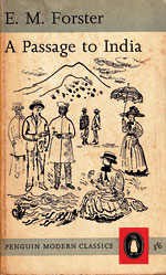
I was glad to get these Forsters to do. There were half a dozen of them and I loved the books anyway—it was a great break. When I did A Passage to India I’d never been there, and I certainly I didn’t know anything about Edwardian life: somebody, Hans Schmoller or John Curtis must have taken quite a risk in getting me to do the series. Even now, when they look to me almost like someone else’s work, I still quite like them as drawings.
The Forsters were all done with a ruling pen on blotting paper, which made one work quickly and definitely to avoid it getting blobby: one had to get it right first time or start again. But other covers like Galsworthy’s In Chancery and Katherine Mansfield’s In a German Pension, which was in two colours, I used an early felt-tip pen called a Flo-master. It smelt of petrol but produced tints from pale grey to a rich black, depending on how hard you pressed it.
South Wind was a redrawing of a watercolour subject I’d made in an Italian hotel window in the small beach town of Cirella di Diamonte, south of Naples. The Horse’s Mouth was drawn quite quickly one evening looking across the river from Cheyne Walk.
But for War in Val d’Orcia and the endpapers for Private Angelo I drew with ordinary fountain pens. The final Forster, Aspects of the Novel in Pelican, was in a different vein entirely, using big hand-drawn letters.
I remember the Penguin party for the arrival in January 1961 of Germano Facetti, an energetic, charismatic and romantic-looking Italian with an aquiline profile, who transformed Penguin’s appearance. It must have been Germano who in 1962 commissioned me to do four Paul Gallico covers, Mrs Harris goes to New York, Flowers for Mrs Harris, Love of Seven Dolls, and Jennie. I’m not keen on these covers now, and don’t think I was a good choice for them. But Germano became a near neighbour and friend, and we remained remained in touch even after he left Penguin for Mondadori and eventually retired to Liguria.
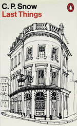
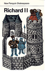
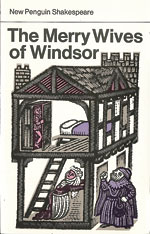
The last jobs I can remember doing for Penguin were two complete sets of covers, for C.P. Snow and for Shakespeare. A single sheet with miniature sketches of the Snows survives, so I must have tackled them as a single job lot. Like the E.M. Forsters, they were drawn on blotting paper, but this time quite tiny—half-size or less—so they could gain extra vigour and blackness when blown up. I didn’t much enjoy reading the Snows and would stop as soon as I reached a passage suggesting a suitable building or landscape for a cover. The first sketches for Corridors of Power, which were not used, showed an imaginary corridor in Whitehall, not unlike the real Foreign Office interiors the FCO commissioned me to draw many years later. Last Things (not on blotting paper) took as its subject a real pub somewhere in Pimlico. The first Snow illustrations were printed against a Penguin orange background, with the title and author in white. Later editions used a white background with the author’s name in black type, and just the title in orange.


