Classic and Classy Penguins
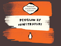
An excerpt from the recently published Penguin By Illustrators.
Edited by Steve Hare and published by the Penguin Collectors Society, Penguin By Illustrators is a collection of talks given at a 2007 gathering of Penguin designers and creatives. The paperbound book features five presentations, an introduction by Phil Baines and two additional chapters by Quentin Blake and David Gentleman. The following excerpt is the text of David Gentleman’s speech, with a selection of accompanying images (there are many more in the book; more than 600 illustrations in all).
David Gentleman has travelled widely and has written and illustrated books on Britain, London, Paris, India, Italy and Anglo-American relations. He has designed British postage stamps and a platform-length mural on the London Underground. There have been many exhibitions of his landscape watercolours and architectural lithographs; his posters have been carried on marches protesting against the wars in Iraq and Gaza.
I was still at the Royal College of Art when Hans Schmoller came to lunch there one day, bringing John Curtis, his new young assistant only recently down from Cambridge. It was the beginning of a connection with John that lasted for around fifty years. This engraving of a mountain hut was the first thing I did for Penguin, and one of the first jobs that I was ever paid for by anybody.
I’d done some wood engraving as a student and it’s a pretty ancient craft—the technique of printing off a raised surface was virtually unchanged since five hundred years ago when Gutenberg and Caxton began. So it’s indicative of the changes that have happened during one’s lifetime—it’s fifty years since I did it, letterpress was still then the normal way to print; now we’re in a different world.
This engraving was for one of the Penguin Classics. I was brand new on the scene then and I was lucky to get the commission. I liked the simple, rather austere, layout—it had first been designed by Jan Tschichold, and Hans Schmoller had either retained the design unchanged or maybe this was already something that he had had his own finger in. It was good to be offered such a job. I read the stories quickly, did a rough in my digs in Battersea at the time and posted it back to Schmoller or John Curtis at Penguin. They sent it back more or less instantly and I engraved it the next weekend and thought that if it would only go on this would be a congenial way to earn a living. And it did go on for quite a while with Penguin.
I did another engraving for the Perrault Fairy Tales, 1957 in Penguin Classics, and four more for The Music Masters under the Pelican imprint. The twentieth-century engraving was an unusual one for me. It was the fourth in a series of dictionaries of music and musicians for which I tried to make engravings that would relate to each of the centuries. I wouldn’t use the word pastiche but they were certainly meant to evoke the period that each book was about. It was done in the Fifties when the twentieth century was still in full swing, and with its Thirties echoes it’s one of the few designs I’ve done that consciously set out to be even vaguely contemporary.
Wines and Spirits was also a wood engraving and survived in many versions through a number of redesigns of the series grid.
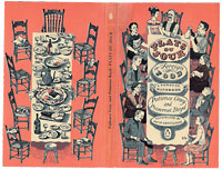
The first big job that I ever did for Penguin was the cookery book Plats du Jour, again in the mid Fifties. Copies of it still survive, battered, weather-beaten and olive oil-stained, because it was a much-used cookbook and it remained on everybody’s kitchen shelves for a long time. It sold—because of Patience Gray and Primrose Boyd’s text—astonishingly well; it really outsold Elizabeth David who was already in the process of becoming a heavyweight herself, and it was a delightful task. I’d had a travelling scholarship from the Royal College, which had taken me widely over France and Italy, and the ideas came from what I’d seen on that journey. The front cover was of a French family beginning their meal; when you turn it over, you see the table at the end of the meal, with the cats sitting among the debris. There’s a Penguin on the cover but no Penguin grid—in this respect, it may have been a first.


