A Fine Press in the City
Purgatory Pie Press By Richard Goodman
It all began with an accident. Dikko Faust, one of the protagonists of this story, was, in 1977, taking a class in typography with Walter Hamady at the University of Wisconsin. Hamady had instructed his students to mind their “p’s” and “q’s”—that is, to make sure these letters, which look quite similar in their type form, were separate and ready to be used. Faust, in attempting to carry out this charge, spilled his box of type onto the floor, thus “pieing” the contents—meaning, as the Random House Unabridged Dictionary has it, “to reduce (printing types) to a state of confusion.” It took him weeks to sort it all out, and for him this was a kind of purgatory.
Thus the origin of the name, Purgatory Pie Press.
Today, Purgatory Pie Press is a husband and wife affair, with Dikko Faust the typographer and printer, and Esther Smith, his wife, the designer. The press is located in TriBeCa, in lower New York City, in rather cramped quarters that contain a small Vandercook Press, drawers of type safely tucked away, and everything else very much demonstrating various works in progress in different states of completion. Faust was the first to come to New York, and then Smith followed shortly thereafter. They married in 1980, and their first joint project—Faust had already printed several books of poetry—was their wedding invitation.
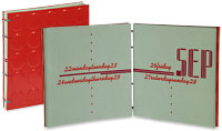
They made their first book together out of necessity—the mother, as we know, of invention. Esther Smith recalls, “I was a freelancer, and I lived by my datebook. One day I was looking around for an inexpensive datebook—oh, maybe for around five dollars—and I just couldn’t find one. So, when I told Dikko about it, we decided to make one ourselves.”
They did, and it became such a popular item that they’ve made one every year since. The one I took home to examine is from 2003, and it exhibits many of the playful, smart, and graceful qualities that distinguish all their work. The cover is made of red Pirelli rubber tires, the paper is Hahnemühle Ingres, and the typeface is Kaufman Bold. It’s simple, it’s elegant, it’s practical, and it’s different. It’s hard not to like, and that’s true of most of Purgatory Pie’s work.
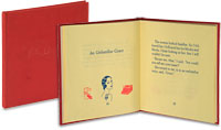
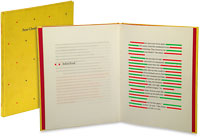
The press’s work can probably be divided into two large categories: traditional books and accordion books. In the former, you have books like Unfamiliar Tales (1982), by Peter Cherches, a series of witty, brief individual stories in which last words of the titles rhyme—e.g., “An Unfamiliar Face,” “An Unfamiliar Race”—told in blue Weiss type on cream paper; Colorful Tales (1983), also by Peter Cherches, in which a series of green, black, red, yellow, and blue lines are punctuated with snippets of text that reminds one of William Burroughs’ cut-ups; and Lily Lou (1986), by Holly Anderson, a quirky tale about a 17 year-old girl who vomits sand—yes, sand—but is cured from that affliction when she loses her virginity.


